ОАО «Международный аэропорт «Манас» 2 ноября 2018 года официально презентовало модернизированный бренд компании.
Цель проекта «Модернизация бренда ОАО «МАМ» - ребрендинг логотипа и фирменного стиля.
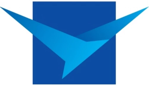
Значение модернизированного логотипа:Логотип состоит из фирменного знака (птица в квадрате) и надписи. Фирменный знак состоит из двух элементов. Первый и основной элемент – «беркут», второй элемент – «небо». Беркут символизирует собой полет, стремление вперед и ввысь. На логотипе он изображен взмывающим в небеса, что означает стремление к развитию, рост и внедрение инноваций.
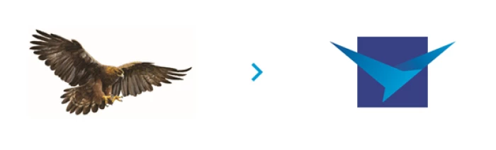 Горный беркут является также одним из символов кыргызского уклада жизни и тесно связан с образом Мана́са – героем одноимённого кыргызского эпоса, знаменитым богатырем, объединившим кыргызский народ.